A day at the resort, made easier on both sides
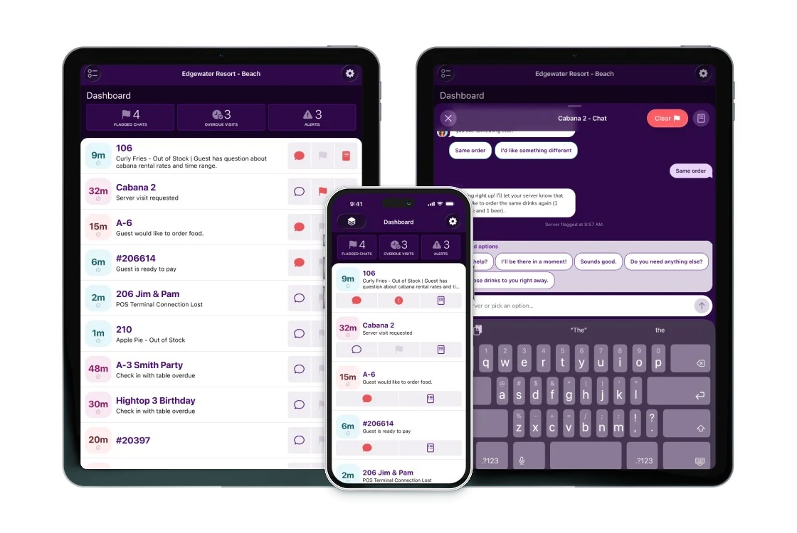
At a Beachy resort, guests book their spot online and order from their chair, while staff manage service from a phone or tablet. I refreshed both sides of the platform and designed Sandy, an AI assistant that connects them.
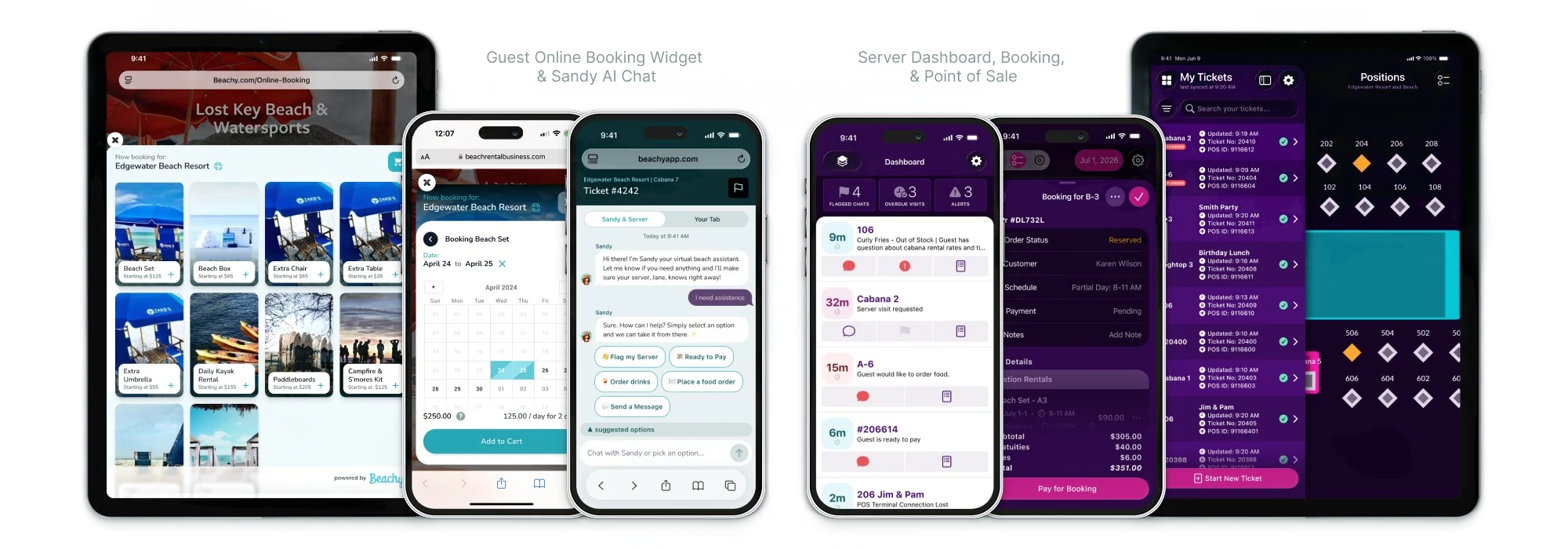
Booking the spot, serving the order
Beachy builds booking and food and beverage technology for resorts, hotels, and beaches. Guests use Beachy to reserve amenities, and staff use it to manage orders.
Growing pains
Over the years, the product had grown feature by feature through various customer requests, and both guests and staff were feeling it.
Inconsistent UI patterns
The interface had drifted as features were added. Navigation needed simplifying, and screens needed to behave the same way across the product.
Service workflows
Guests needed a more convenient way to make requests, while servers needed a way to receive and act on them within their existing workflows.
An outdated booking experience
Guests were booking upscale resorts through an interface that looked dated and didn’t adapt well to different layouts.
Seeing it end to end
I started by reviewing the existing interfaces to find where the experience could be simpler or more consistent. I looked at how guests moved through online booking and how staff used the food and beverage app during a shift.
After setting priorities with the client, I split the work into two kinds: visual updates that made screens easier to read, and workflow changes where people were getting stuck.
Easier for guests, faster for staff
Most of the internal tools only needed a visual refresh to adopt the iOS 26 liquid glass style, so the bigger changes went into structure and flow. Guests wanted booking to be simple, and staff needed to keep service moving.
For staff, I did the following:
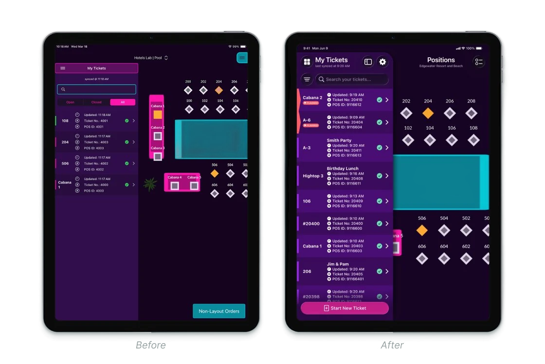
- Made navigation placement consistent across tablet and mobile experiences and updated the navigation to use iOS 26 patterns
- Nested little-used filters into a single menu and added additional filters
- Condensed multiple booking lists (layout map, layout list, non-layout) into a single entry point
- Updated iconography to remove repetitive icons and use a single style
- Increased contrast, reduced the number of colors used and tightened spacing to make visual scanning easier
- Added new dashboard screens for Sandy and table touchpoints
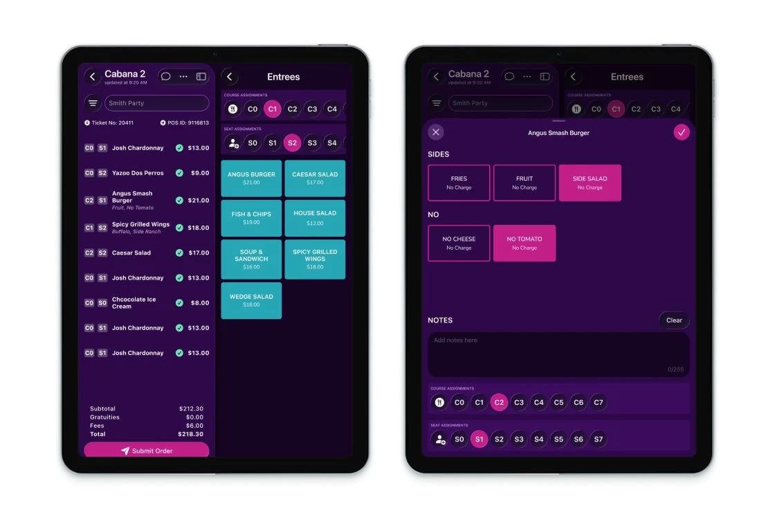
- Added seating and coursing for fine-dining service
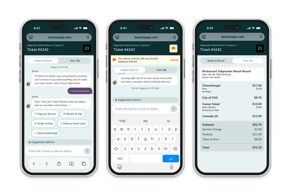
- Added chat flags and conversations, quick drink adds and speedbar payments
For guests, I did the following:
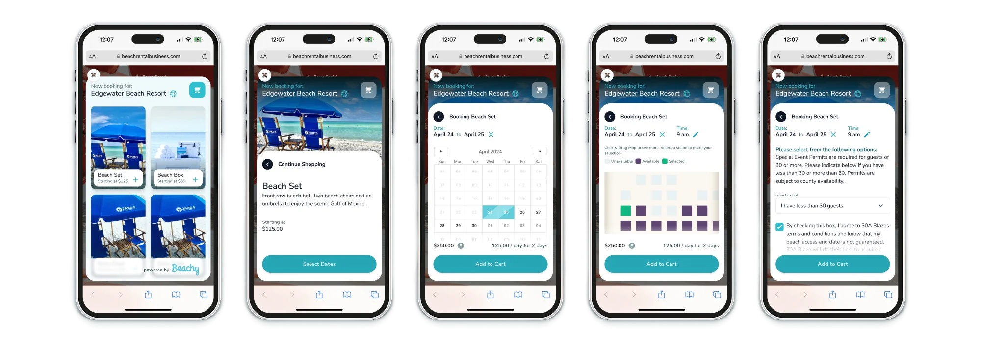
- Implemented sticky headers and footers for extended content screens
- Updated spacing and color contrast for better legibility
- Removed unnecessary elements
- Adjusted padding and font sizing based on screen size
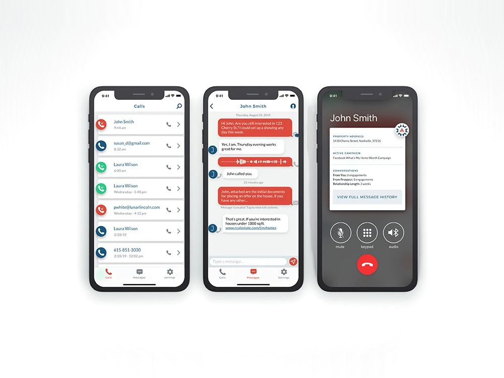
- Added Sandy, so guests can order and make requests by chat